> ## Documentation Index
> Fetch the complete documentation index at: https://chatbotx.io/docs/llms.txt
> Use this file to discover all available pages before exploring further.
# Analytics
> Track chatbot performance, Bot and human engagement rates, new contact sources, and response times by channel in ChatbotX Analytics.
**Analytics** is ChatbotX's reporting hub, where you can monitor chatbot activity and team performance in real time. From here, you can see which channels perform best, which team members reply the fastest, and whether your Bot is handling conversations well or needs Flow improvements.
## Overview
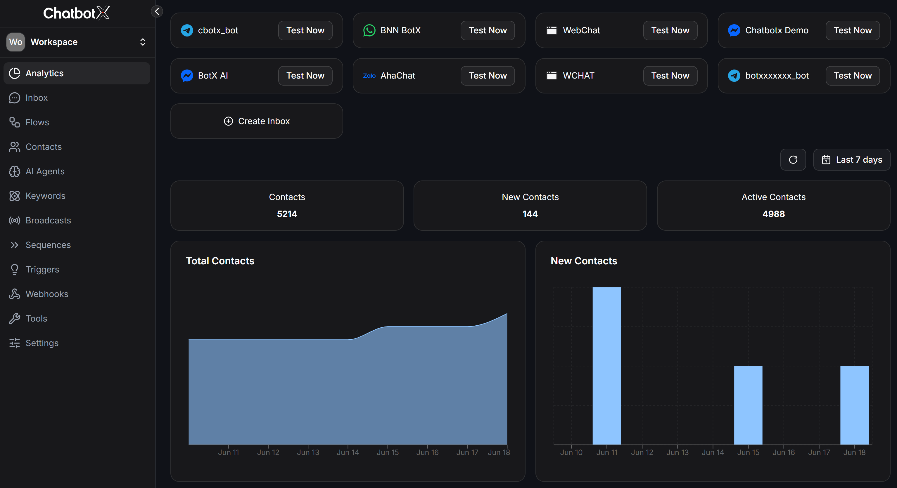
At the top of the page, ChatbotX shows the list of integrated channels and the 3 most important metrics:
 ### Integrated Channels (Inboxes)
The top section of the Analytics page lists all active messaging channels (inboxes) in your Workspace (e.g., Telegram, Zalo, WhatsApp, Webchat, Messenger):
* **Channel Name and Type**: Displays the logo of the platform along with the inbox name.
* **Test Now Button**: Allows you to quickly test sending and receiving messages for that specific channel.
* **+ Create Inbox Button**: Enables you to quickly add and integrate a new messaging channel (inbox) directly from the Analytics dashboard.
### Core Metrics
Below the channels list, there are 3 core performance metrics:
The total number of contacts in your system. The green number below shows the percentage of growth compared with the previous period.
The number of contacts added during the selected date range. This reflects how well you are attracting new customers.
The number of contacts that had at least one interaction during the selected period. This metric shows how active your database really is.
## Filters and date range
Before reading any number, set the right filters first:
* **Date range**: Click the calendar icon in the top-right corner to choose:
* Today / Yesterday
* Last 7 days / Last 30 days
* This Month / Last Month
* Lifetime (full history)
* Custom Range (choose your own start and end date)
### Integrated Channels (Inboxes)
The top section of the Analytics page lists all active messaging channels (inboxes) in your Workspace (e.g., Telegram, Zalo, WhatsApp, Webchat, Messenger):
* **Channel Name and Type**: Displays the logo of the platform along with the inbox name.
* **Test Now Button**: Allows you to quickly test sending and receiving messages for that specific channel.
* **+ Create Inbox Button**: Enables you to quickly add and integrate a new messaging channel (inbox) directly from the Analytics dashboard.
### Core Metrics
Below the channels list, there are 3 core performance metrics:
The total number of contacts in your system. The green number below shows the percentage of growth compared with the previous period.
The number of contacts added during the selected date range. This reflects how well you are attracting new customers.
The number of contacts that had at least one interaction during the selected period. This metric shows how active your database really is.
## Filters and date range
Before reading any number, set the right filters first:
* **Date range**: Click the calendar icon in the top-right corner to choose:
* Today / Yesterday
* Last 7 days / Last 30 days
* This Month / Last Month
* Lifetime (full history)
* Custom Range (choose your own start and end date)
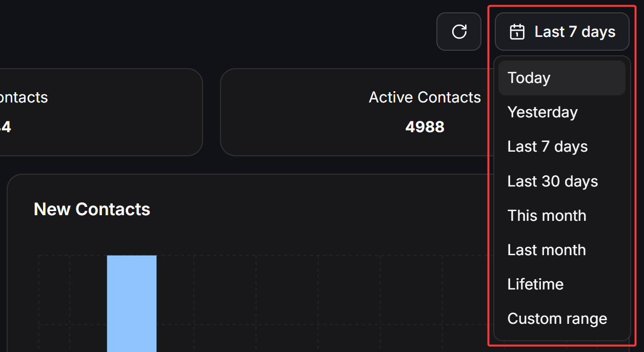 Analytics shows **Last 7 days** by default. Switch to 30 days when you want a clearer view of the real trend.
## Contact growth charts
Right below the overview metrics, you will see 2 line charts:
**Total Contacts:** The running total of contacts over time. This line can only stay flat or go up, not down.
**New Contacts:** New contacts by day. This line makes it easier to see how well your ads or Entry Point Links are bringing in new people.
Analytics shows **Last 7 days** by default. Switch to 30 days when you want a clearer view of the real trend.
## Contact growth charts
Right below the overview metrics, you will see 2 line charts:
**Total Contacts:** The running total of contacts over time. This line can only stay flat or go up, not down.
**New Contacts:** New contacts by day. This line makes it easier to see how well your ads or Entry Point Links are bringing in new people.
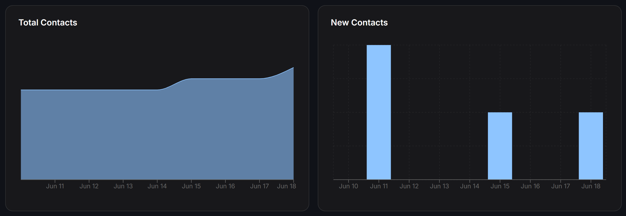 How to read these charts:
* **A sudden spike:** Usually comes from a Broadcast or an ad campaign that ran that day
* **Steady weekly growth:** Your Bot and Trigger are working well
* **A long flat line:** No new traffic is coming in, so review your Entry Points or campaigns
## Response performance
### Response time charts
**Average response time (Minutes):** A line chart that compares:
* **First response time:** How long it takes for Bot or human to send the first reply when a customer starts a conversation
* **Response time:** The average reply time across the full conversation
**Average first response time by humans:** A pie chart that shows the share of First Response Time by each team member. If one person takes the largest share, they are usually handling the highest volume and responding the fastest.
**Average response time by humans:** Similar to the chart above, but it measures overall average reply time instead of only the first reply.
**Average duration of a conversation:** The average length of a conversation from the first message to the last.
A long Response Time is not always bad. If the conversation is a detailed consultation, a longer exchange can be completely normal. Compare it with actual conversions instead of judging the time alone.
## Human Agents
The **Human Agents** table lists each team member in detail:
How to read these charts:
* **A sudden spike:** Usually comes from a Broadcast or an ad campaign that ran that day
* **Steady weekly growth:** Your Bot and Trigger are working well
* **A long flat line:** No new traffic is coming in, so review your Entry Points or campaigns
## Response performance
### Response time charts
**Average response time (Minutes):** A line chart that compares:
* **First response time:** How long it takes for Bot or human to send the first reply when a customer starts a conversation
* **Response time:** The average reply time across the full conversation
**Average first response time by humans:** A pie chart that shows the share of First Response Time by each team member. If one person takes the largest share, they are usually handling the highest volume and responding the fastest.
**Average response time by humans:** Similar to the chart above, but it measures overall average reply time instead of only the first reply.
**Average duration of a conversation:** The average length of a conversation from the first message to the last.
A long Response Time is not always bad. If the conversation is a detailed consultation, a longer exchange can be completely normal. Compare it with actual conversions instead of judging the time alone.
## Human Agents
The **Human Agents** table lists each team member in detail:
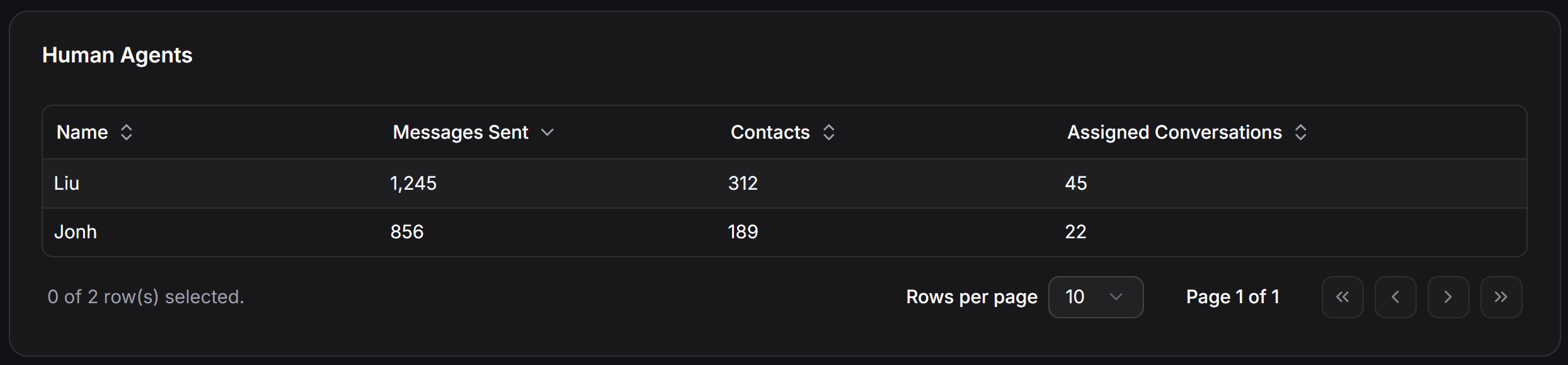 | Column | Meaning |
| -------------------------- | ----------------------------------------------- |
| **Name** | Team member or admin name |
| **Messages Sent** | Total messages sent by that person |
| **Contacts** | Number of unique contacts they handled |
| **Assigned Conversations** | Number of conversations assigned to that person |
Use this table to:
* Evaluate each team member's productivity
* Rebalance assignments if one person is overloaded
## Bot performance
This section displays 4 charts to help you comprehensively evaluate your bot's activity and bot-human interaction:
| Column | Meaning |
| -------------------------- | ----------------------------------------------- |
| **Name** | Team member or admin name |
| **Messages Sent** | Total messages sent by that person |
| **Contacts** | Number of unique contacts they handled |
| **Assigned Conversations** | Number of conversations assigned to that person |
Use this table to:
* Evaluate each team member's productivity
* Rebalance assignments if one person is overloaded
## Bot performance
This section displays 4 charts to help you comprehensively evaluate your bot's activity and bot-human interaction:
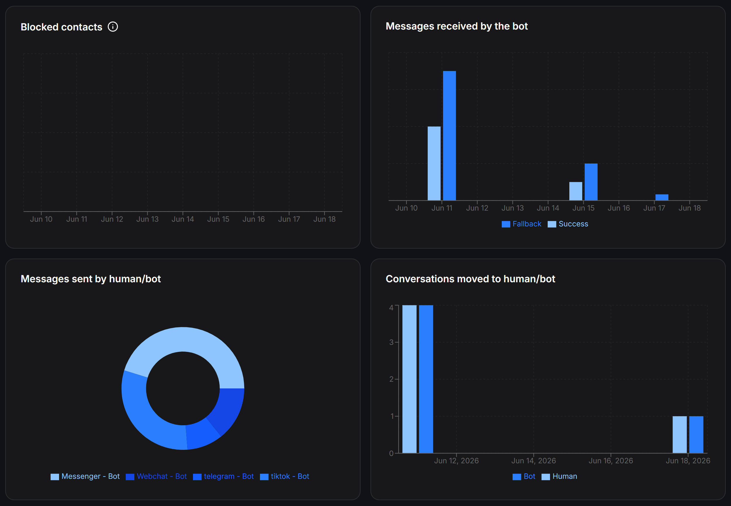 ### Blocked contacts
The line chart tracks the number of contacts who blocked the bot over time. If this number spikes, review your most recent Broadcast. The content may be frustrating customers and causing them to block the Bot.
### Messages received by the Bot
The bar chart is split into 2 categories:
* **Success** (light blue): Messages the Bot understands and answers with a Flow
* **Fallback** (dark blue): Messages the Bot does not understand, so it triggers the fallback Flow
If the **Fallback** rate accounts for more than 30% of total received messages, review your Keywords and AI Training. Your Bot is missing too many customer requests.
### Messages sent by source
The pie chart divides sent messages by source: Messenger - Bot, Webchat - Bot, Telegram - Bot, TikTok - Bot, and other channels. It shows which channel is being processed most by the Bot.
An ideal ratio is around 70-80% Bot. That gives you strong automation while still leaving room for human support when needed.
### Bot/Human handoff
**Conversations moved to human/bot:** A daily bar chart split into:
* **Bot** (light blue): How many times a team member hands a conversation back to the Bot
* **Human** (dark blue): How many times the Bot hands a conversation to a team member
## Conversation analysis
This section displays 4 charts to help you monitor conversation distribution and status within your team:
### Blocked contacts
The line chart tracks the number of contacts who blocked the bot over time. If this number spikes, review your most recent Broadcast. The content may be frustrating customers and causing them to block the Bot.
### Messages received by the Bot
The bar chart is split into 2 categories:
* **Success** (light blue): Messages the Bot understands and answers with a Flow
* **Fallback** (dark blue): Messages the Bot does not understand, so it triggers the fallback Flow
If the **Fallback** rate accounts for more than 30% of total received messages, review your Keywords and AI Training. Your Bot is missing too many customer requests.
### Messages sent by source
The pie chart divides sent messages by source: Messenger - Bot, Webchat - Bot, Telegram - Bot, TikTok - Bot, and other channels. It shows which channel is being processed most by the Bot.
An ideal ratio is around 70-80% Bot. That gives you strong automation while still leaving room for human support when needed.
### Bot/Human handoff
**Conversations moved to human/bot:** A daily bar chart split into:
* **Bot** (light blue): How many times a team member hands a conversation back to the Bot
* **Human** (dark blue): How many times the Bot hands a conversation to a team member
## Conversation analysis
This section displays 4 charts to help you monitor conversation distribution and status within your team:
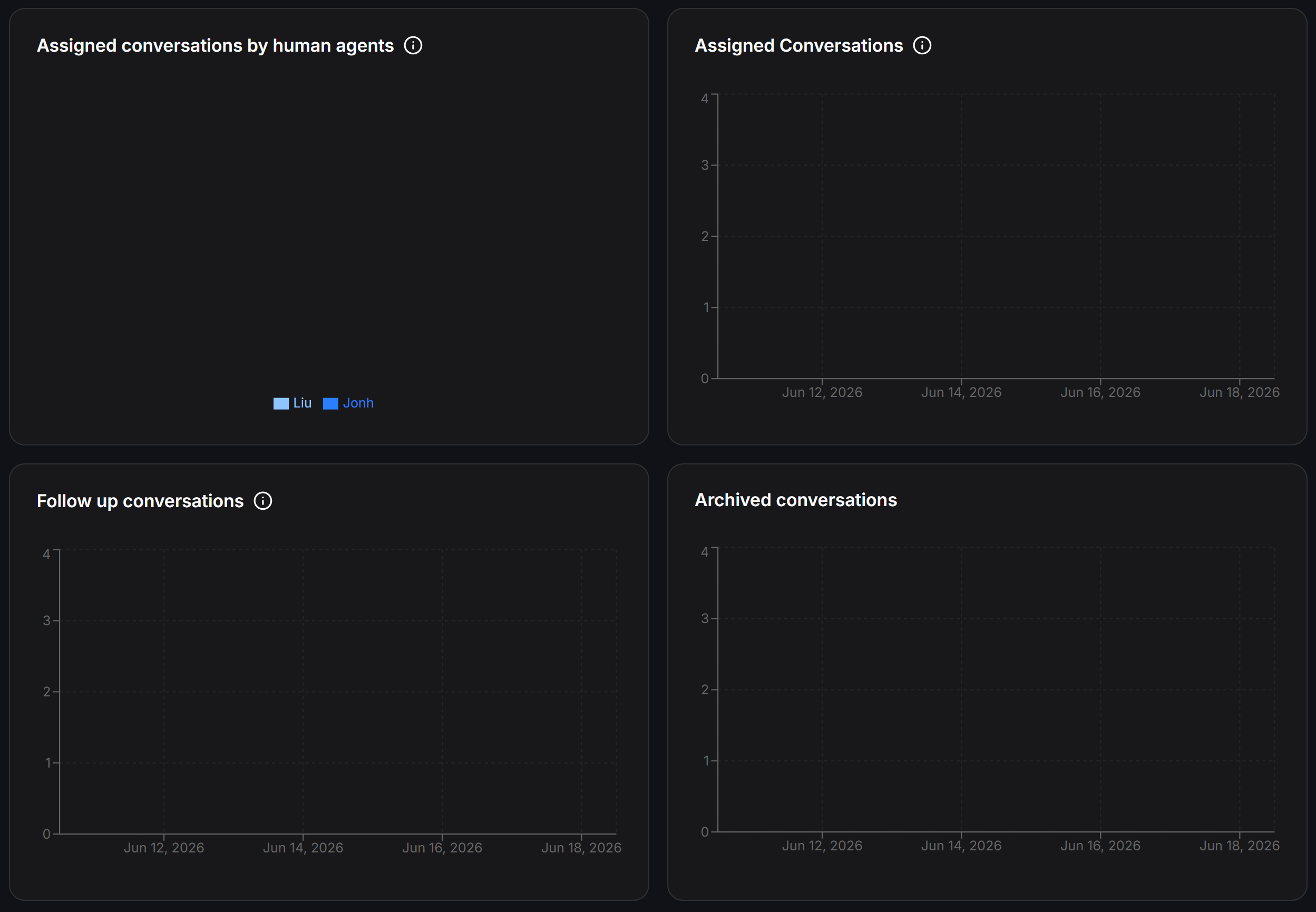 A pie chart showing how assigned conversations are distributed across team members. Use it to evaluate workload distribution.
A daily bar chart showing how many conversations were assigned each day. Peaks often line up with Broadcast days.
The number of conversations marked for Follow Up and still need another contact. Use this to track leads that are not closed yet.
The number of conversations archived during the selected period. This usually grows alongside the volume of completed conversations.
## Contact analysis
This section displays 4 pie charts to help you analyze contact sources and distribution by channel, entry source, and country:
A pie chart showing how assigned conversations are distributed across team members. Use it to evaluate workload distribution.
A daily bar chart showing how many conversations were assigned each day. Peaks often line up with Broadcast days.
The number of conversations marked for Follow Up and still need another contact. Use this to track leads that are not closed yet.
The number of conversations archived during the selected period. This usually grows alongside the volume of completed conversations.
## Contact analysis
This section displays 4 pie charts to help you analyze contact sources and distribution by channel, entry source, and country:
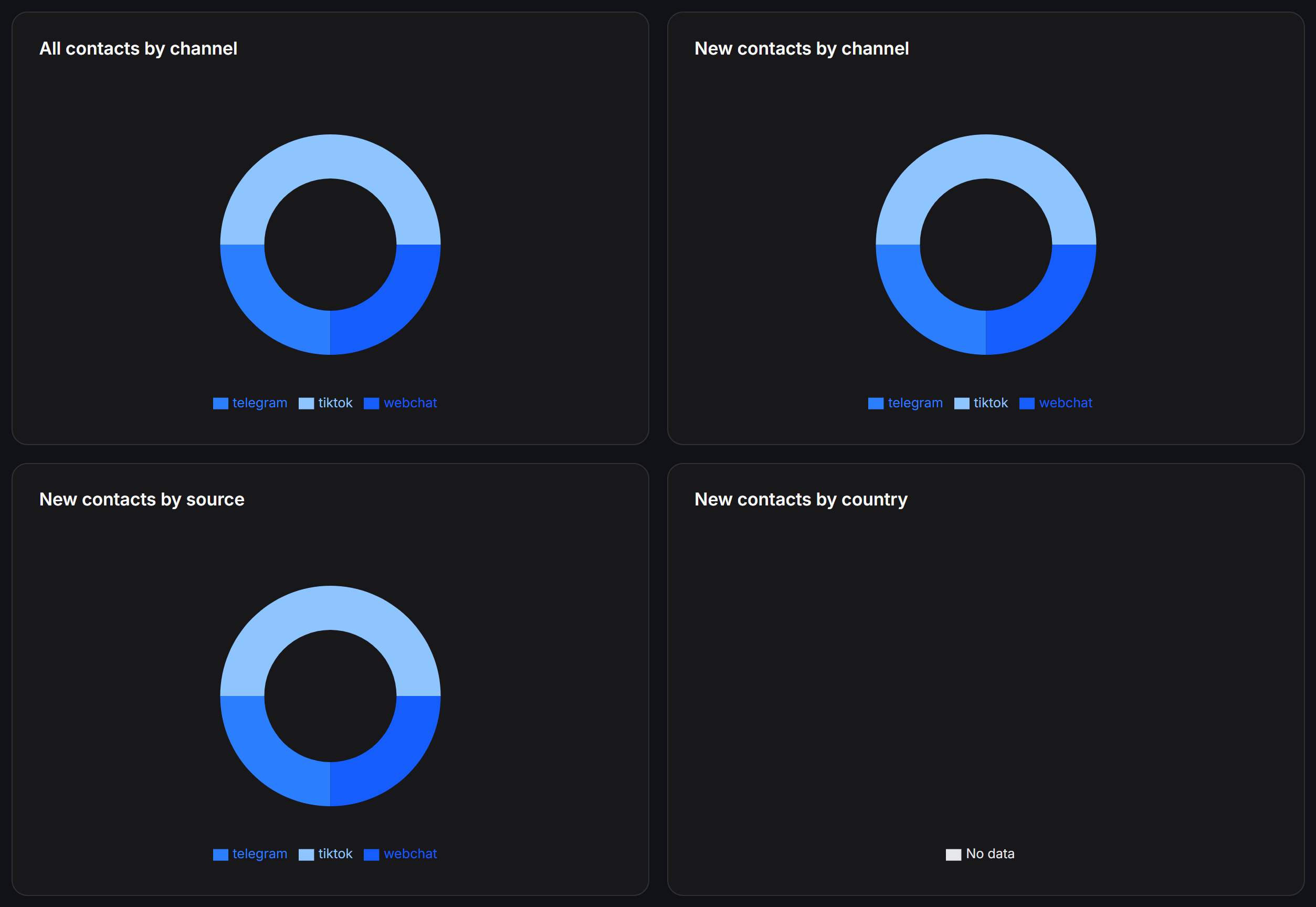 ### All contacts by channel
A pie chart that groups all contacts in the database by channel (Telegram, TikTok, Webchat...). It shows which channel has the largest share.
### New contacts by channel
A pie chart that groups new contacts by channel. It helps you see which channel is attracting the most new customers in the selected period.
### New Contacts by Source
A pie chart that groups new contacts by acquisition source:
| Source | Meaning |
| ------------------- | ----------------------------------------------------------------------- |
| **Direct** | The customer starts the conversation directly from your Page or channel |
| **Bot Link** | The customer enters through an Entry Point Link (Ref Link) |
| **Inbound Message** | The customer comes from a Click-to-Message ad |
| **Webchat** | The customer starts from the widget on your website |
Use this data to see which marketing channel is performing best and deserves more investment.
### New contacts by country
A pie chart grouping new contacts by country. Know where your customers are so you can adjust content and sending times to match the right time zone.
## Weekly Analytics checklist
Each week, review Analytics in this order:
Review the New Contacts chart. Is the number growing compared with last week? If it drops for 2 weeks in a row, review your Entry Points.
Go to Bot Performance and review the Fallback flow rate. If it is above 30%, filter the messages the Bot did not recognize and add them to Keywords or AI Training.
Review the Human Agents table. If any team member has a First Response Time above 1 hour, they may need a reminder or a different assignment load.
If this number rises, review that week's Broadcast. The sending frequency or message content may be bothering customers.
Which source is bringing in the most contacts? Increase budget or improve content for that channel.
### All contacts by channel
A pie chart that groups all contacts in the database by channel (Telegram, TikTok, Webchat...). It shows which channel has the largest share.
### New contacts by channel
A pie chart that groups new contacts by channel. It helps you see which channel is attracting the most new customers in the selected period.
### New Contacts by Source
A pie chart that groups new contacts by acquisition source:
| Source | Meaning |
| ------------------- | ----------------------------------------------------------------------- |
| **Direct** | The customer starts the conversation directly from your Page or channel |
| **Bot Link** | The customer enters through an Entry Point Link (Ref Link) |
| **Inbound Message** | The customer comes from a Click-to-Message ad |
| **Webchat** | The customer starts from the widget on your website |
Use this data to see which marketing channel is performing best and deserves more investment.
### New contacts by country
A pie chart grouping new contacts by country. Know where your customers are so you can adjust content and sending times to match the right time zone.
## Weekly Analytics checklist
Each week, review Analytics in this order:
Review the New Contacts chart. Is the number growing compared with last week? If it drops for 2 weeks in a row, review your Entry Points.
Go to Bot Performance and review the Fallback flow rate. If it is above 30%, filter the messages the Bot did not recognize and add them to Keywords or AI Training.
Review the Human Agents table. If any team member has a First Response Time above 1 hour, they may need a reminder or a different assignment load.
If this number rises, review that week's Broadcast. The sending frequency or message content may be bothering customers.
Which source is bringing in the most contacts? Increase budget or improve content for that channel.